Why Online Appointment Booking Feels More Confusing Than It Should
Discover why online appointment booking confuses customers and how clearer options, forms, availability and confirmations improve the experience.
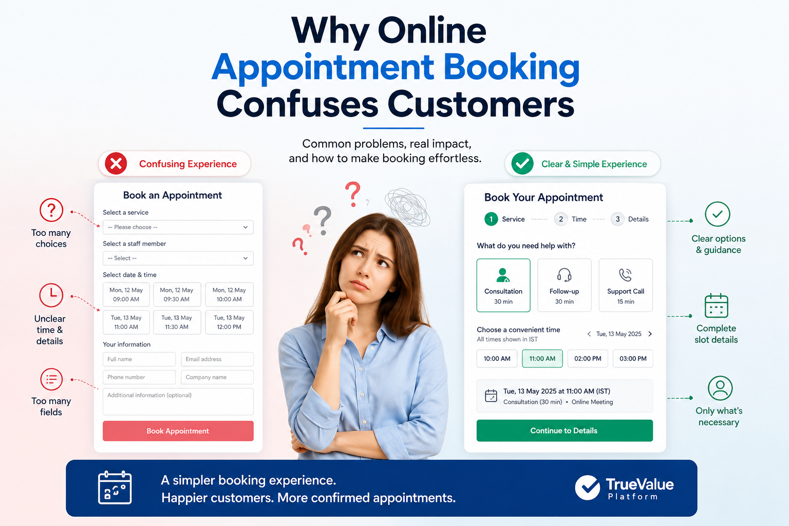
Online appointment booking becomes confusing when customers must interpret internal service names, choose from too many options, guess important details, complete unnecessary fields or wait for an unclear confirmation.
A good booking journey should quickly answer five questions:
What should I book?
Is this appointment right for me?
When and where will it happen?
What information must I provide?
What happens after I submit the booking?
A customer visits a website to book a consultation.
They expect three simple steps: choose a service, select a time and confirm the appointment.
Instead, they see several similar appointment types, unfamiliar staff names, unclear locations and a long form. The available slots do not show a time zone, and the page does not explain whether the appointment will take place online, by phone or in person.
The customer pauses. They may leave the page, decide to call later or abandon the booking completely.
The problem is not online booking itself. Confusion begins when a website exposes the business’s internal processes instead of guiding the customer towards one clear next step.
Common mistake 1: Using internal service names
Businesses often use appointment names such as:
Discovery session
Initial assessment
Service consultation
Customer review
Employees may understand these terms, but a first-time customer may not know which option is right.
A clearer appointment name explains the purpose and expected outcome.
Instead of:
Discovery session
Use:
Discuss your requirements with our team — 30 minutes
Instead of:
Service assessment
Use:
Get help choosing the right service — 20 minutes
Each option should explain who the appointment is for, what will happen, how long it will take and whether it is online or in person.
Common mistake 2: Offering too many choices
More options do not always create a better experience.
Imagine a property services website offering:
Property consultation
Maintenance assessment
Damage inspection
Emergency inspection
Virtual consultation
General enquiry
A customer dealing with water damage may not know which option to choose. Is the situation urgent enough for an emergency inspection? Should they arrange a virtual consultation first?
A better approach is to begin with one simple question:
What do you need help with?
Then show clearer options:
Report urgent property damage
Arrange a routine inspection
Discuss maintenance work
Ask a general question
Customers should not have to understand a company’s workflow before they can ask for help.
Common mistake 3: Showing time slots without context
A time slot such as:
Tuesday at 2:30 pm
may leave several questions unanswered.
Which time zone is being used? How long will the appointment last? Is it online or at a branch? Who will handle it?
A clearer version would be:
Tuesday, 11 August at 2:30 pm IST30-minute video consultation with the customer support team
Customers should see the time zone, duration, meeting format and location before confirming their booking.
Common mistake 4: Asking for too much information
A simple booking form may only need:
Name
Email address or phone number
Reason for the appointment
One optional notes field
Some forms also request company details, account numbers, identification information and lengthy background details.
This makes a simple booking feel like an application process.
Ask only for the information needed to create and prepare for the appointment. When an unusual field is necessary, explain why.
For example:
Customer reference numberThis helps our team find your existing account before the appointment.
Common mistake 5: Giving unclear confirmation messages
After booking, customers may see:
Your request has been received.
But this does not explain whether the appointment has been confirmed.
A useful confirmation should include:
Booking status
Date and time
Time zone
Duration
Meeting format or location
Host or responsible team
Rescheduling and cancellation options
What happens next
For example:
Your appointment is confirmed
Date: Tuesday, 11 August 2026Time: 2:30 pm ISTDuration: 30 minutesFormat: Online meetingNext step: A meeting link will be sent by email.
Customers should not need to contact the business simply to understand whether their booking was successful.
Five questions every booking page should answer
1. Which appointment should I choose?
Use customer-friendly names and explain the purpose of each option.
2. Is this appointment suitable for me?
State who it is for and what the customer can expect.
3. When and where will it happen?
Show the date, time zone, duration, meeting format and location.
4. What information do I need to provide?
Request only essential details and explain unusual fields.
5. What happens after I book?
Confirm the status and explain the next step, including how to reschedule or cancel.
The website journey starts before the calendar
Many businesses focus only on the booking form, but confusion often begins earlier.
A visitor may not know which service is suitable, what the appointment includes, what to prepare or whether booking is the correct next action.
A clearer website journey should:
Explain the service.
Show who it is for.
Answer common questions.
Direct the visitor to the correct booking option.
Request only essential information.
Provide a clear confirmation.
TrueValue Platform Site Flow supports website-facing experiences such as forms, submissions, FAQs, chatbot conversations, analytics and appointment widgets. These capabilities can help businesses provide clearer information before a visitor reaches the booking stage.
The separate Appointments Product supports operational scheduling areas such as appointment types, host availability, booking links, public booking, rescheduling, cancellation, attendees and appointment lifecycle management.
Together, the website can present a simple customer journey while the business manages the scheduling details behind it.
Simple appointment-booking checklist
Are appointment names written in customer-friendly language?
Is the purpose of each appointment clear?
Are the time zone, duration and meeting format visible?
Are only essential form fields required?
Are error messages easy to understand?
Is the booking status clearly stated?
Can customers reschedule or cancel easily?
Does the website explain what customers should expect?
Is there one clear booking action?
Does the journey work well on mobile?
A clear booking experience does not mean the business has simple operations. Teams may still need to manage hosts, branches, venues, reminders, transfers and no-shows.
The important principle is simple:
Keep operational complexity behind the customer experience, not in front of it.
A first-time customer should know what to choose, when the appointment will happen and what comes next.
Explore more on Site Flow to discover how clearer forms, helpful website content, FAQs and appointment widgets can help visitors move from interest to action.
Related Articles & Insights
Continue exploring connected workflows, product playbooks, and strategic guides.
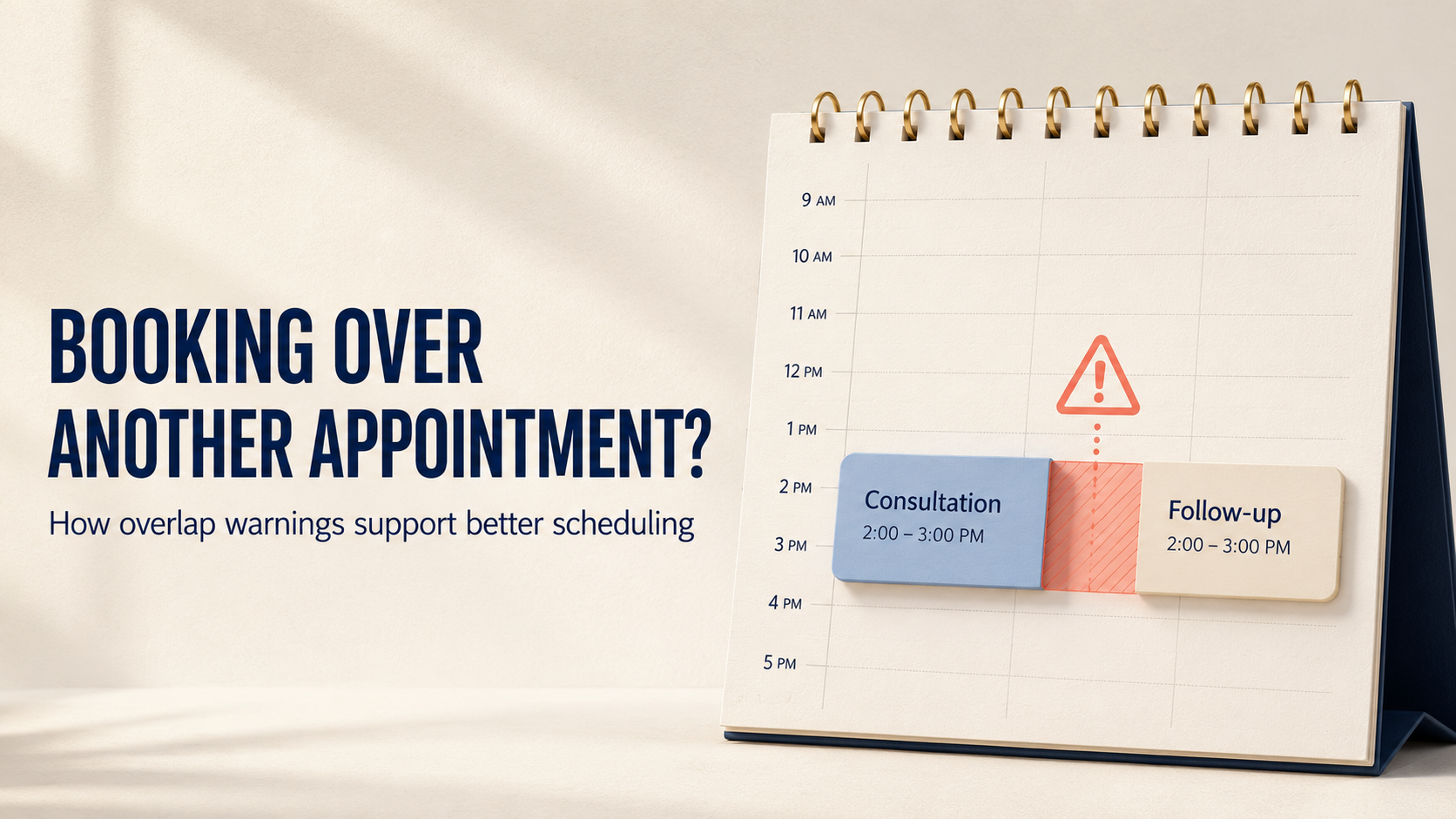
Booking Over Another Appointment? How Overlap Warnings Support Better Scheduling
Learn why appointment overlaps happen, how warning-and-override workflows support better decisions, and what teams should review before confirming a conflict.
.png)
How Many Business Tools Are Quietly Slowing Your Team Down?
Reduce manual handoffs, repeated data entry and disconnected workflows. Discover how connected business systems can help your teams work better together.
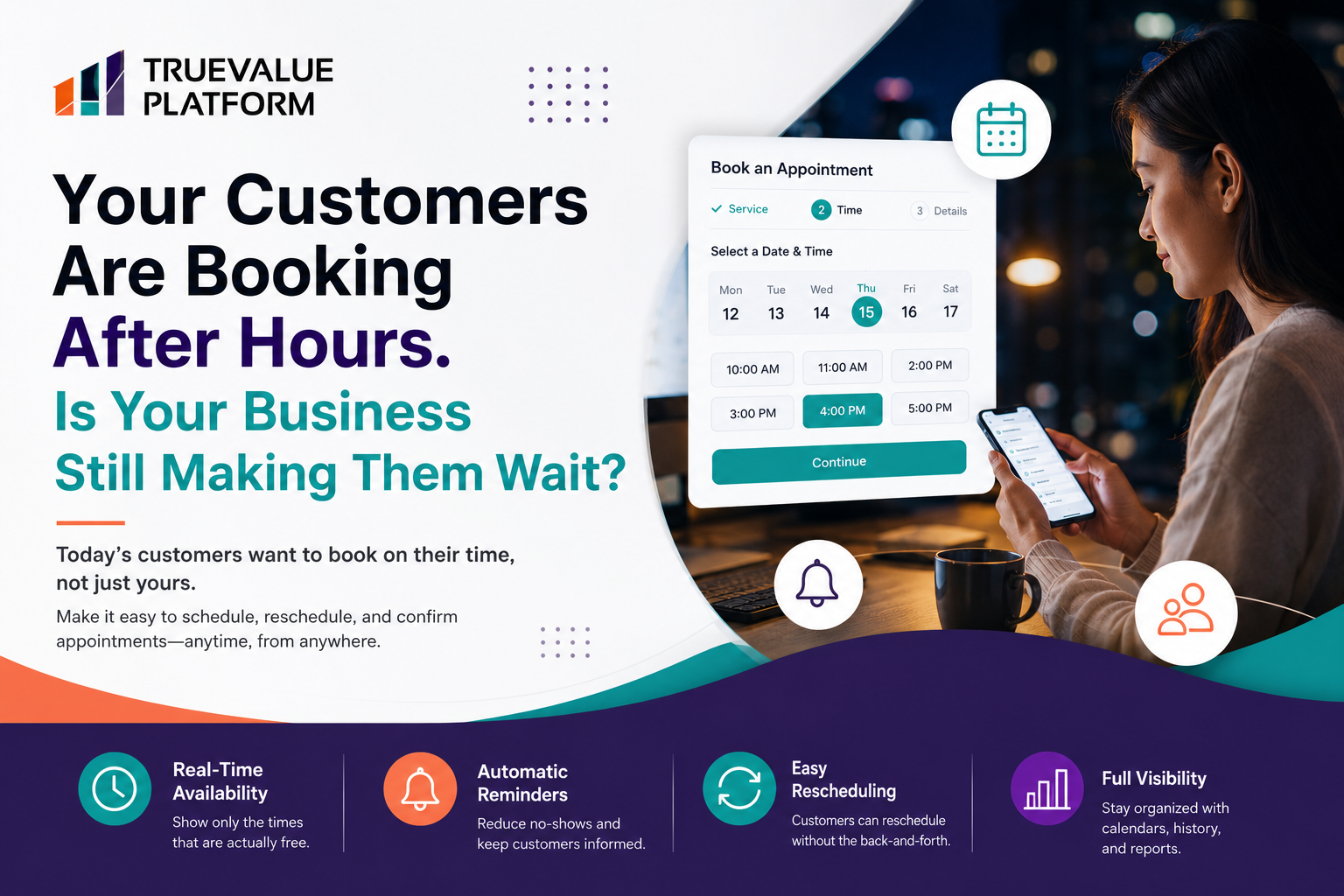
Your Customers Are Booking After Hours. Is Your Business Still Making Them Wait?
Customers make decisions after hours. Learn how self-service appointment booking can reduce friction and create a smoother customer journey.