Dashboard Sprawl in 2026: Why More Reporting Can Make Decisions Slower
More dashboards do not always create better decisions. Learn how dashboard sprawl creates reporting friction and how to move from visibility to action.
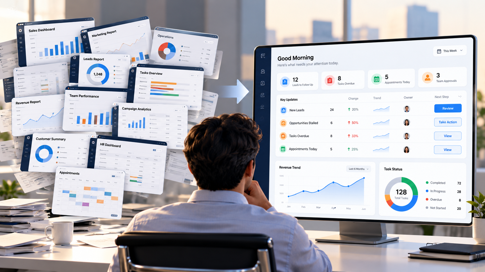
A growing business rarely suffers from a shortage of numbers. Sales has a pipeline dashboard. Marketing has campaign reports. Operations has task boards. Managers may also receive spreadsheets, weekly summaries and ad-hoc exports.
Together, they can create a new problem: dashboard sprawl.
Dashboard sprawl happens when reports multiply faster than the organisation’s ability to define which metrics matter, who owns them and what action should follow. The result is strange but common: leaders can see more information while feeling less certain about what to do next.
That is why the business-intelligence conversation in 2026 is shifting from “How much can we measure?” to a better question:
Does this information help someone make a decision?
More Dashboards Do Not Automatically Create More Clarity
A dashboard is valuable when it shortens the distance between a signal and a decision.
Imagine a dashboard showing 18 overdue customer follow-ups is useful only if the team can also understand who owns them, why they are delayed and what should happen next.
Otherwise, the dashboard becomes another place to look.
Gartner argued in June 2026 that dashboards designed for decision support need more than visualised data. They need decision, driver and data context so users can understand what a number means and how it should influence action.
Reporting tells you what happened.
Decision support helps you decide what to do.
The Hidden Cost of Dashboard Sprawl
Dashboard sprawl usually develops gradually.
One department creates a report because the existing one does not answer a specific question. Another team builds its own version of the same metric. A manager keeps a spreadsheet because they do not fully trust either dashboard.
Soon, the business has several versions of “pipeline value”, “active customer” or “open task”.
TechTarget highlighted this problem in 2026, noting that dashboard sprawl can introduce duplicate tools, conflicting definitions and additional governance work.
The real cost is the time employees spend asking which number is correct, why reports disagree and who owns the underlying data.
When people must interpret the reporting system before they can interpret the business, visibility has become friction.
A Good Dashboard Should Answer Four Questions
Before adding another report, test whether the existing one answers four questions.
1. What Changed?
A useful dashboard should make meaningful movement easy to notice.
Users should not have to scan dozens of widgets to discover the one signal that actually matters.
2. Why Does It Matter?
A number without context can produce the wrong reaction.
Imagine Employee A has 12 tasks while Employee B has three.
The obvious response might be to redistribute the work. But complexity, deadlines, dependencies and responsibility can completely change the picture.
Our guide to workload balance and task context explains why managers need context before reacting to task counts.
The number is the signal. The context determines the decision.
3. Who Owns the Next Action?
Every important exception should lead somewhere.
If a sales opportunity has stopped moving, who reviews it?
If tasks are overdue, who decides whether to reassign, reschedule or escalate?
Without ownership, a dashboard can describe the same problem repeatedly without helping anyone resolve it.
4. What Happens Next?
The strongest operational view does not end at:
Red. Down. Overdue.
It helps the user identify a next step.
That might mean following up, reviewing a record, reassigning work, contacting a customer or deciding that no action is required.
Move From Dashboard-First to Workflow-First Thinking
IDC argued in July 2026 that business intelligence is increasingly moving closer to the workflow rather than remaining isolated inside dashboards.
That suggests a useful design principle.
Instead of asking:
“What dashboard should we build?”
Start with:
“What decision is someone trying to make?”
A sales manager may need to identify opportunities requiring attention. A team lead may need to spot blocked work.
Once the decision is clear, the information required to support it becomes clearer too.
This is also why a CRM full of customer information can still be difficult to use.
A record becomes more actionable when a team can quickly understand the owner, current stage, next action and follow-up timing. Our guide to keeping CRM follow-ups clear explores this distinction between simply storing information and making it usable.
Connected Operations Can Reduce Reporting Friction
Dashboard sprawl is often a symptom of fragmented operations.
Different teams create separate reporting because the underlying work already lives in separate places.
TrueValue Platform takes a connected-business-operations approach across Products including CRM, Appointments, Marketing, Site Flow, Task, PBX, HR and Recruit.
The goal is not one giant screen containing every possible metric.
It is making operational context easier to follow as work moves between customers, tasks, appointments and teams.
A useful principle is:
See the signal → Understand the context → Identify the owner → Take the next action.
That sequence is more valuable than simply adding another chart.
Frequently Asked Questions
What is dashboard sprawl?
Dashboard sprawl is the uncontrolled growth of dashboards, reports and metric views across a business, often resulting in duplicated information, conflicting definitions and unclear ownership.
How many dashboards should a business have?
There is no ideal number. A better test is whether each dashboard has a defined audience, purpose, metric ownership and decision it is intended to support.
How can businesses reduce dashboard sprawl?
Start by identifying duplicate reports, agreeing on metric definitions, removing unused views and connecting important reporting to clear owners and actions.
Better Decisions Need Less Ambiguity, Not More Charts
The next reporting improvement may not be another dashboard.
It may be clearer definitions, fewer competing views, better ownership and a stronger connection between information and action.
Before building the next report, ask:
What decision will this help someone make?
If the answer is unclear, the dashboard probably is too.
Businesses reviewing how their customer, task, appointment and operational workflows fit together can Request a Demo of TrueValue Platform.
Related Articles & Insights
Continue exploring connected workflows, product playbooks, and strategic guides.

AI Agent Sprawl Is the Next Business Software Problem: How to Stay in Control in 2026
AI agents are multiplying across business workflows. Learn how to recognise agent sprawl and create clearer ownership, permissions, data and human oversight.

Will AI Agents Replace Business Software? What Changes When Work Moves From Clicks to Outcomes
AI agents may not replace business software, but they could radically change how people interact with it. Explore what happens when work shifts from navigating screens to requesting outcomes.

The Real AI Transformation Is Workflow Redesign — Not Just Adding Another Tool
Adding AI to an old workflow does not automatically transform work. Learn a practical five-step method for redesigning processes around people, ownership and AI.